站点介绍
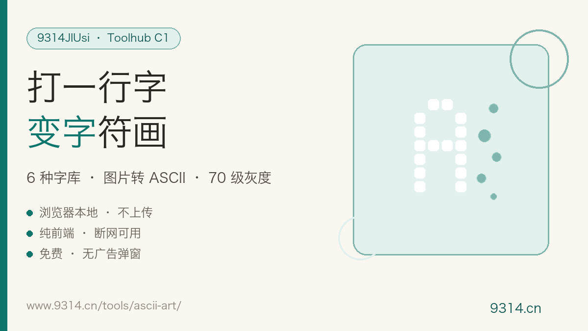
The first ASCII banner I ever saw was on an old server's login screen: one figlet-rendered WELCOME, wider than the terminal. When I started running my own boxes, the first thing I did after SSH-ing in was swap the MOTD for my own letters — an old-school programmer pleasure. This page turns it into two terminals: type-to-art, and image-to-characters.
Classic FIGlet fonts carry assorted licensing terms — inlining them into a page asks for trouble. So these are built from scratch: each of the 95 characters gets a stroke-segment definition at coordinate level, rasterized into a 5x7 base grid, then five more styles derive from geometric transforms — slant shifts rows sideways, shadow adds a bottom-right 1px drop, mini window-samples rows and columns down. The generator is 300 lines of Python producing 6 × 95 = 570 glyphs in 24KB, generated once, inlined forever.
Each pixel's weighted luminance (0.299R + 0.587G + 0.114B) maps onto the 70-level ramp: dark areas get dense characters like @%, light areas get dots and spaces. One detail is non-negotiable — monospace glyphs are rectangles about twice as tall as wide, so without correction every picture stretches; this page folds the aspect ratio 2:1 automatically. The invert toggle lets dark-terminal people play too.
No, and said plainly: the six fonts cover exactly the 95 printable ASCII characters (letters, digits, common punctuation). Encoding thousands of CJK glyphs as page-embedded dot matrices isn't realistic. For non-Latin text, screenshot it and feed the image to the image-to-ASCII panel below — the effect is just as good.
block is the classic 5x7 dot matrix, safest in terminals; shadow adds a bottom-right drop shadow for depth; slant shifts each row sideways for an italic lean; mini packs letters into 3x5 so more fit per line; script compresses to 5 rows for a casual feel; outline keeps only stroke skeletons — lightest ink. Switch fonts on the same line and see the difference live.
Built from scratch: every glyph's shape is mathematically defined by stroke rules (horizontal, vertical and diagonal segments rasterized onto a grid) — not traced from any existing typeface, so there are no licensing strings. A generator script produced all 6 fonts × 95 characters, inlined into the page; it works offline.
The image is resampled to your chosen width, then each pixel's luminance is computed (0.299R + 0.587G + 0.114B) and mapped onto a 70-level character ramp from @ down to a space — the classic @%#*+=-: ladder, dense characters for dark areas, sparse for light. Monospace glyphs are about twice as tall as wide, so the tool corrects the aspect ratio 2:1, otherwise everything comes out stretched.
Paste it as a section banner in code comments, as a terminal MOTD welcome, or as a README sign — plain text holds its shape anywhere. Open downloaded .txt files with a monospace font (Consolas on Notepad, or just use VS Code); proportional fonts will scatter the picture.
No. Font rendering and grayscale mapping all run inside this device's browser — zero uploads, zero requests. Text and settings live in this browser's localStorage; the footer button clears them in one click.
中文版:https://www.9314.cn/tools/ascii-art/
相似站点
评论列表 (0条)